Posters and other projects that fits nicely on the wall.

Malmø

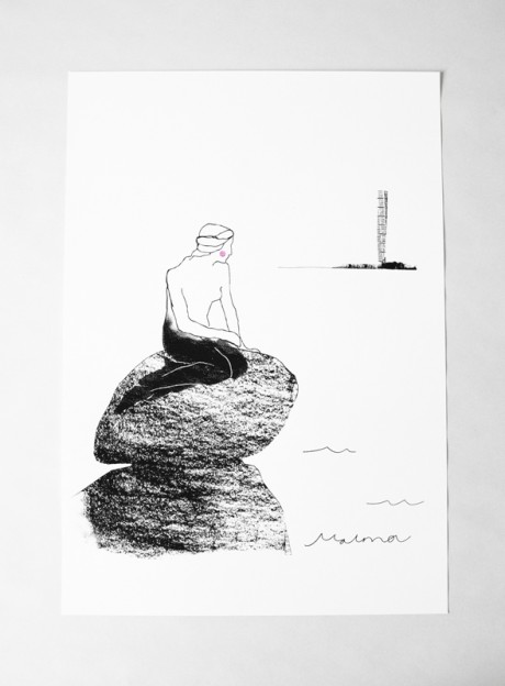
How would it look if jollygoodfellow did a tourist motif for Malmö, we asked ourselves about a year ago.

So we started to sketch down some different ideas where Turning Torso – the twisted tower nowadays a given symbol for the city and also the tallest building in Sweden – was the main subject.

When we took out the sketches again we liked the idea to let the Danish icon “The Little Mermaid ” also play a role.We added a slight blush as a subtle indication that she has seen the impressive building on the other side of the water.

The title Malmø (with a Danish ø) has become a wave in the sea.

The black color is screen printed and the red color is stamped on a heavy swedish paper (Munken Lynx 240 gr).

Hope you enjoy it! You can order it here in our shop.


By |2020-04-17T11:17:26+02:00May 30th, 2013|ON WALL|Comments Off on Malmø

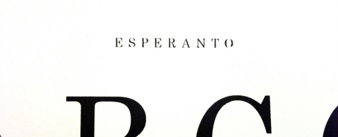
Esperanto

Ĉu vi parolas Esperanton? (Do you speak Esperanto?)

It’s really fascinating this ambitious idea to create a new language to foster harmony between people. Esperanto is, after 125 years, still spoken, but I guess English is hard to compete with (which we also use on this web site). If it wasn’t for M. A. Numminen we might not have thought about it  that much. But a language he knows and even sings in must be worth a hand silkscreened poster!

Esperanto is the most widely spoken constructed international auxiliary language. Its name derives from Doktoro Esperanto (“Esperanto” translates as “one who hopes”), the pseudonym under which L. L. Zamenhof published the first book detailing Esperanto, the Unua Libro, on July 26, 1887. Zamenhof’s goal was to create an easy-to-learn and politically neutral language that transcends nationality and would foster peace and international understanding between people with different regional and/or national languages.

wikipedia

This poster is part of a series we are working on that explores the graphic expression of languages (and the relationships between people) with the starting point in Sweden, where we live.

Buy it here in our shop!

See also ABÇ-plansch.


By |2020-04-17T11:17:26+02:00December 11th, 2012|ON WALL|1 Comment

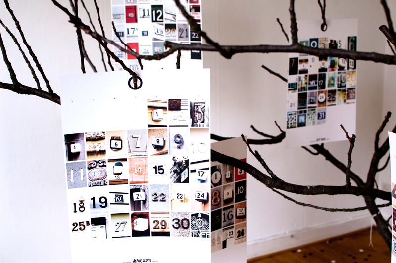
2013 NORDIC in a tree

We had a fantastic release party, people have left, but a tree full of next year’s days remain.

By |2023-09-26T14:09:30+02:00October 8th, 2012|CALENDAR, ON WALL|Comments Off on 2013 NORDIC in a tree

urbnCal c/o Rädda Barnen Sverige

raddabarnen
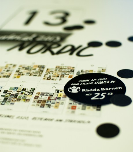
A large pre-order from Rädda Barnen Sverige played a crucial role when we decided to go for a new edition of urbnCal. It is a great honor for us and we have also decided to donate 25 sek to Rädda Barnen
for every calendar sold in Sweden (if you live outside Sweden we leave it up to you if you want to donate some money or time to charity, maybe your local Save the Children organisation?).

The calendar is ready and the first packages have left for Stockholm, Oslo, Taipei and Osaka. Next Saturday 6/10 it’s time for release!

By |2020-04-17T11:17:26+02:00September 26th, 2012|CALENDAR, notes, ON WALL|Comments Off on urbnCal c/o Rädda Barnen Sverige

Sisaret poster

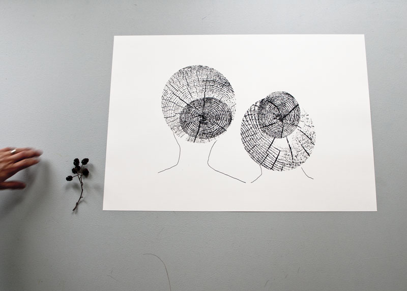
Sisaret is the Finnish word for sisters, you can read more about the print  “Sisaret” and have a look at the tote bag – version here.

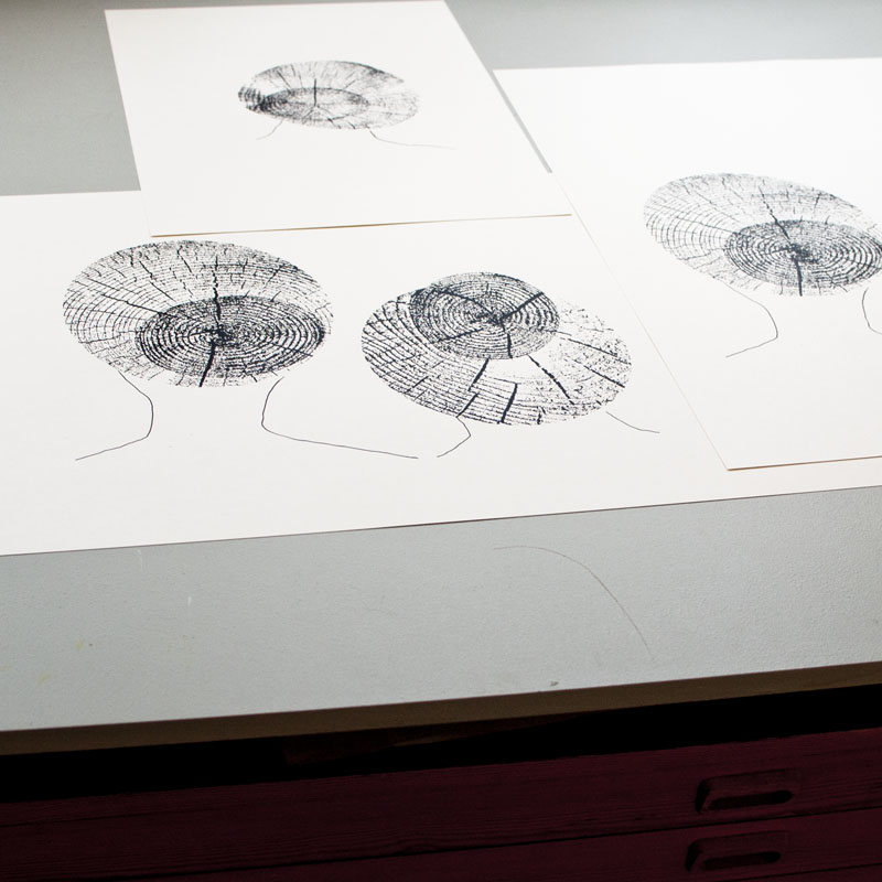
The poster is  screen printed by hand on heavy off-white (Munken Pure 240g) uncoated swedish paper.
Size: 46×64 cm (18×25 inches) Stamped title and  signed with pencil (which you can also see in the picture below).

Available here !


By |2020-04-17T11:17:27+02:00September 1st, 2012|ON WALL|Comments Off on Sisaret poster

ABÇ-plansch (poster)

abcdsc_0122

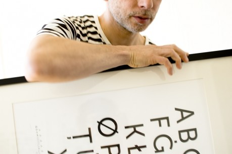
For us it has been a lot of numbers in recent years, so now it’s time for some characters.

The inspiration for this print comes from our new hometown Malmö (in the southern part of Sweden). A city where about 50% of the population has other native languages than Swedish. The ABÇ-plansch, an extended abc-poster, is our way of celebrating the great variety of expressions and a chance for us to enjoy exiting graphic shapes.

The selection is based on form and we have focused on the Latin alphabet and languages found in Europe. After some research we had an overwhelming amount of characters, to get the abc-feeling we kept 26 at a large size and placed the rest in three lines at the bottom of the print.

abcdsc_0086

abcdsc_0111

abcdsc_0084

abcdsc_0085

We think this print fits in a kids room (since today’s gifted kids already know how to read before they start kindergarten 😉 or to anyone who enjoy a graphic look.

Paper: Munken Pure 240g
Edition: Numbered 200
Print: Screen printed by hand
Typeface: Museo Sans
Design: L. E. Tanttu – jollygoodfellow, Sweden

Available at Supermarket and Nordic Design Collective.

By |2020-04-17T11:17:27+02:00May 16th, 2012|ON WALL|1 Comment

Jussi on the wall

“My juicer is not meant to squeeze lemons; it is meant to start conversations” P. Starck.
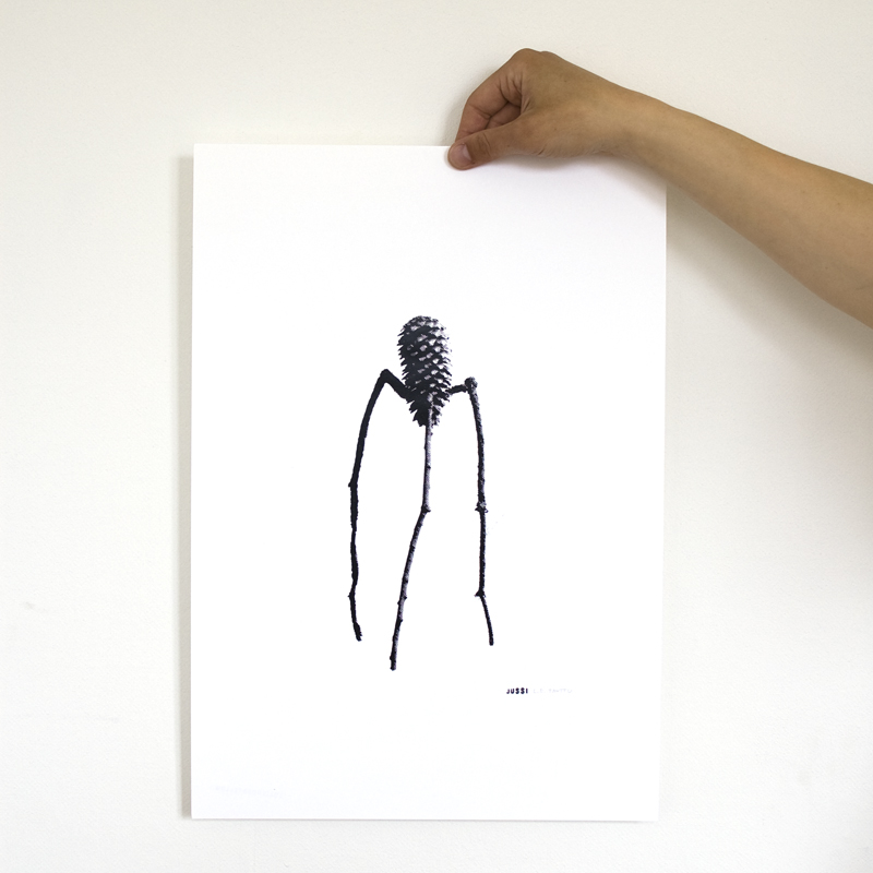
This is our version of the design classic. We call it Jussi.
Screen printed by hand this time on white heavy uncoated swedish paper. (Munken Lynx 240g). Size: 32×46 cm (12.5×18 inches). Stamped title and  signed with pencil (L. E. TANTTU).Available here in our shop

By |2020-04-17T11:17:27+02:00May 3rd, 2012|ON WALL|Comments Off on Jussi on the wall
Go to Top