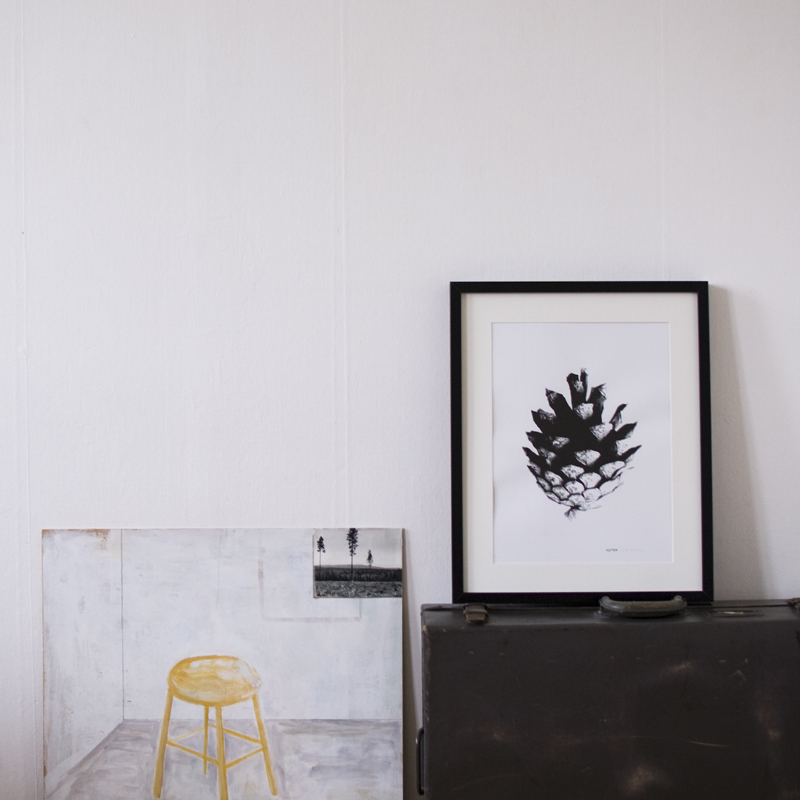
ABÇ-plansch (poster)

abcdsc_0122

For us it has been a lot of numbers in recent years, so now it’s time for some characters.

The inspiration for this print comes from our new hometown Malmö (in the southern part of Sweden). A city where about 50% of the population has other native languages than Swedish. The ABÇ-plansch, an extended abc-poster, is our way of celebrating the great variety of expressions and a chance for us to enjoy exiting graphic shapes.

The selection is based on form and we have focused on the Latin alphabet and languages found in Europe. After some research we had an overwhelming amount of characters, to get the abc-feeling we kept 26 at a large size and placed the rest in three lines at the bottom of the print.

abcdsc_0086

abcdsc_0111

abcdsc_0084

abcdsc_0085

We think this print fits in a kids room (since today’s gifted kids already know how to read before they start kindergarten 😉 or to anyone who enjoy a graphic look.

Paper: Munken Pure 240g
Edition: Numbered 200
Print: Screen printed by hand
Typeface: Museo Sans
Design: L. E. Tanttu – jollygoodfellow, Sweden

Available at Supermarket and Nordic Design Collective.

By |2020-04-17T11:17:27+02:00May 16th, 2012|ON WALL|1 Comment

Jussi on the wall

“My juicer is not meant to squeeze lemons; it is meant to start conversations” P. Starck.
This is our version of the design classic. We call it Jussi.
Screen printed by hand this time on white heavy uncoated swedish paper. (Munken Lynx 240g). Size: 32×46 cm (12.5×18 inches). Stamped title and  signed with pencil (L. E. TANTTU).Available here in our shop

By |2020-04-17T11:17:27+02:00May 3rd, 2012|ON WALL|Comments Off on Jussi on the wall

Kotten poster

Kotten, the first printwe’ve ever done together as jolllygoodfellow, hera as poster.

Screen printed by hand on heavy uncoated swedish paper. Available both in off-white (Munken Pure 240g) and white (Munken Lynx 240g).

Size: 46×64 cm (18×25 inches) Stamped title and  signed with pencil (L. E. TANTTU).

For sale here in our shop

By |2020-04-17T11:17:27+02:00May 1st, 2012|ON WALL|Comments Off on Kotten poster

Kosläpp

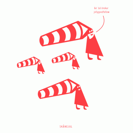
After a winter in the barn Anders Nilsson’s cows finally came out (“kosläpp” in swedish). Some hesitated but once they stepped out into the green it was impossible to miss the joy, and we enjoyed watching them!
By |2017-10-03T10:31:59+02:00April 17th, 2012|inspiration|Comments Off on Kosläpp

the basement work space (1)

dsc_00432

This is jollygoodfellows new screen printing home. We just need to get a good working table in place, more lightning and a bass drum to the drum kit, this room is going to be super!

By |2020-04-17T11:17:28+02:00February 23rd, 2012|process|2 Comments

One month left…

Today it’s the first of December and the new year begins in a month. So it’s really time to say more about urbnCal 2012! We started with Stockholm 2010, then Copenhagen, and 2012 it is Helsinki!

urbncal_show01

How long does it take to make the calendar?
The first part is ”collecting” all the numbers. We spend about a week biking around the city, one area at the time, shooting pictures. We take turns, one of us is playing with the kids and the other is taking photos.
During the evening when the kids are asleep we go through the days harvest and name the pictures by street address and file them in folders, one for each month.
The next step is to adjust the photographes and place them in Indesign, our lay out-program. We check so the pictures work well together and crop them. This is usually when we have to kill our darlings or at least crop our darlings.

urbncal_show02

How did the idea come about?
We had the idea for a few years before we had the courage to try it in the summer/fall of 2009. We didn’t know if we could complete it or if it was too big a task and who would like to sell the calendar. One inspiration for the calendar was an earlier idea to make congratulation cards out of numbers plates. We have an interest for everyday details.

Why is it called urbnCal?
urbnCal stands for urban calendar. The idea from the beginning was to photograph many cities and compare the graphic impression of the numbers plates in different countries. We also needed a nice web address (url) because we wanted to publish the picture on the web, link to a map and get feed back etc. Maybe the calendar will get more of a digital life in the future?
There is no room for notes, how should I use the calendar?
The wall calendar is intended as a visual complement to a pocket diary or digital calendar. We see it more as a poster with a function. But there is some room if you really want to make notes, maybe with a golden pen.

urbncal_show03

Tech spec:
• 12 sheets (jan-dec) + 1 sheet with a list of all street addresses.
• High quality uncoated FSC-certified paper in three shade of white. (Munken Rough,170 g/m2)
• Format: A3 (11,7×16,5 in) with a 20 mm (0,8 in) hole for hanging.
• 2 colors: black & white photographs + colored details
• Packing: paper bag with handprinted logo
• Edition: 500

You can find it att Etsy, supermarket, Signerat

and here you find more retailers

urbncal_overview01

Which city is next?
We haven’t decided on the next city yet, but we are thinking of a Scandinavian calendar, reuse some numbers and get some new in Oslo, maby Reykjavik as well. If you have any suggestions feel free to contact us!

By |2020-04-17T11:17:28+02:00December 1st, 2011|CALENDAR, ON WALL|Comments Off on One month left…